CRNY Designers Joelle Riffle and James Thacher in Conversation
The CRNY team is fortunate to have partnered with graphic designer and artist Joelle Riffle and moving image artist James Thacher to shape CRNY’s program logos, social media & newsletter animations, posters, and visual assets. It’s been a joy working alongside James and Joelle; we’ve learned a great deal from them about their respective design experience, project development, research, and creative processes. Here, we discuss their artistic practices; the concepts behind the Artist Employment Program and Guaranteed Income for Artists logo development; intersections among design, activism, community building, and collective movement; and other exciting projects that both artists are working on now.
Joelle, can you tell us a bit about the concept behind the AEP and GI logo designs and any inspiration you drew from during their creation?
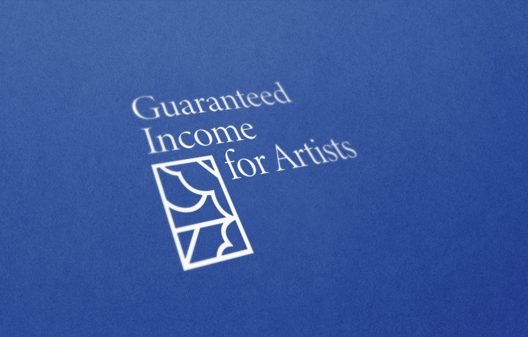
[Joelle Riffle] The first thing I do in any design project, especially one as rich and impactful as this one is to research and explore concepts and precedents that feed the work. In this case, the work of both the Artists Employment Program and Guaranteed Income for Artists pulls from a rich legacy of initiatives to materially support and fund artists and their work, such as the CETA Artists Project, which employed hundreds of artists in New York City. I wanted to draw a connection between these two moments and to highlight the artists who were part of that movement. In my research, I came across the work of artist Ellsworth Ausby with which I felt an immediate resonance. As a graphic designer, I felt compelled by the boldness, vibrancy, and graphic qualities of his work. In particular, one piece “Untitled, 1971” drew me in and became the direct inspiration for both brands; a crop of the piece is reflected in the logomark for the programs. This deep research and inspiration process is often invisible to the naked eye, but as both a creative process for developing a meaningful brand with weight and narrative, it’s key. I’m honored to have been able to reflect the legacy of CETA and Ausby in the logomark.
And James, what was it like to animate and elaborate on Joelle’s CRNY logos and design assets?
[James Thacher] Joelle’s work was such a delight to use as a foundation and visual language for my animated elements. I didn’t know about the Ellsworth Ausby inspiration, but I love the resonance with his style of clean geometric forms rendered by hand, the complementary effect of a designed structure that is made using the quirks and idiosyncrasies of human hands. Perhaps this resonance is reflective of CRNY itself as an intentional project backed by a lot of research, data, and design while simultaneously expressed through the eclectic artwork of all the people involved. I’ve also really enjoyed playing with the two logomarks and colors that correspond to each program.
Generally speaking, how do you both approach brand and logo design when working with a small team such as CRNY’s?
[JR] My favorite thing about being an independent designer is the opportunity to embed myself in the teams that I collaborate with. The “getting to know one another” process is everything, not just for logistics and process but for really understanding what it is that the team I’m working with is trying to do. I like to go deep, facilitating a conversation where I’m trying to find out: What is it you need people to know about the work you’re doing? What myths or misconceptions are you working against? What does this work mean to you personally? Every member of a small team like CRNY has a reason to be there, doing the work that they do—and I find that often, the truth of that brand lives inside that reason. It’s my job to excavate it and make it legible and compelling to audiences outside of the organization.
[JT] I’d echo a lot of what Joelle has said. There’s something really exciting about the amalgamated nature of this project and the challenge of creating visuals that encompass the multitude of art practices supported by CRNY and the open-ended possibilities of what people will create with this support. I got the sense that everyone on the team, regardless of their role, also had to embrace that diversity and make sure not just the branding was accessible, but that all of the applications, materials, etc. were accessible too. That curiosity and openness to experimentation came through my conversations with the team and allowed me some space that’s not always available in larger organizations.
Joelle and James, what draws you to a specific design concept, especially as the concept might foreground activism, community building, or collective movement? Further: how do your design and creative works intersect with your activism and related community engagement work?
[JT] There’s definitely some serendipity in how I develop and build on a concept, but it always emerges from a lot of research and exploration. There are obvious parallels with programs like the New Deal era Federal Art Project and the CETA program that Joelle mentioned. Those both have a rich visual history. Communicating their message faced similar although not identical challenges, so it’s a great touchstone to start with. Animation also has a long standing relationship to community building and programs that benefit the public good. Animators like Faith and John Hubley and Bill Davis created playful and experimental work for NY public television and shows like Sesame Street that are a big influence for me. But I also want to ground work like this in the moment we currently face and the ways people communicate. Animated GIFs are actually a great fit for reaching a wide audience right now, so I created a series of loops based on a sample of art practices that can be used by artists and the wider public.
[JR] The research components of any kind of design project are so important to me because I find that, particularly with movement work and community building, the work is always building on a previous something. There are always individuals, organizers, artists, workers who have contributed to knowledge and are doing the work I’m seeking to learn about and contribute to. Absorbing that work is crucial to making meaningful work in anything related to activism, community building, and movements, transcending cliché, appropriation, or shallow signaling with a “look and feel.” When you know who is doing the work, what they produced to communicate about it, who the artists and makers are in the community, then you can start to think about the graphic concept, the story you want to tell that feels true to the mission.
[JT] Totally agree with the perils of the shallow approach to this work that you often see. Part of that is not taking the easy route of activism clichés, and part of it is trusting your own personal style and response to a project. As someone also navigating the precarious art and design world in New York, these issues are not abstract to me. It’s hard to make rent in New York!
What other projects are you both working on currently (if you’re able to discuss them, that is)? What recent project are you particularly proud of?
[JT] I’m currently finishing a hybrid live action/animated short that should be out early next year. It involves mountain lions, mushrooms, and growing up. A personal piece I enjoyed creating recently was about visual migraines and the hallucinations they cause. Other than that, I’ve been spending a lot of my spare time organizing with fellow tenants in Brooklyn to fight displacement and rent increases—and to build tenant power.
[JR] Right now, I’m working on another project that is keeping me in the archives. I’m designing an exhibition with the Norman B. Leventhal Map and Education Center at the Boston Public Libraries, which uses urban atlases as a tool to unlock layers of Boston’s geographic history. The content of the exhibition itself is rich with historical artifacts and ephemera, so it’s part of my job to bring a contemporary lens through graphics and exhibition design, helping visitors to the exhibition understand how the building up of Boston over the last 150 years impacts their lives today.
***
Joelle Riffle is a Boston-based freelance graphic designer and artist who employs 2D design methods—type, image, form, color—to make complex messages clear and accessible. She appropriates those same tools in her artistic practice to manipulate, complicate, and invert meaning through collage, visual memoir, and the designer’s grid. Through her work alongside nonprofits, organizers, artists, and small businesses, she aims to design vibrant visual languages and tools to educate, inspire, and advance a better (and prettier) world. https://joelleriffle.com/
James Thacher is a moving image artist based in Brooklyn. He utilizes hand-made animation techniques to explore ideas of vision, memory, and historical struggle. https://www.jamesthacher.com/